Live & Learn Italian
Website Redesign. Arriverderci, it’s One on One.
I’ve been to Italy loads. Last year (2025) I went twice. In fact, for the second trip I stayed in both Venice and Vicenza, so I’m counting that as three times. And for someone that doesn’t really like holidays, I view that as unacceptably excessive. In the past I’ve been to Rome, Pisa, Verona, Milan, Lake Garda and somewhere else. I’ve been so many times I’ve forgotten the names of places. So my Italian must be in pretty good shape, right?
Absolutely not. Except for the word ‘pompino’, which an Italian waiter in a Shoreditch fish restaurant once taught me. I’ll leave it with you to work out what it means (and why he thought I would need this information, which I’m still unsure of).
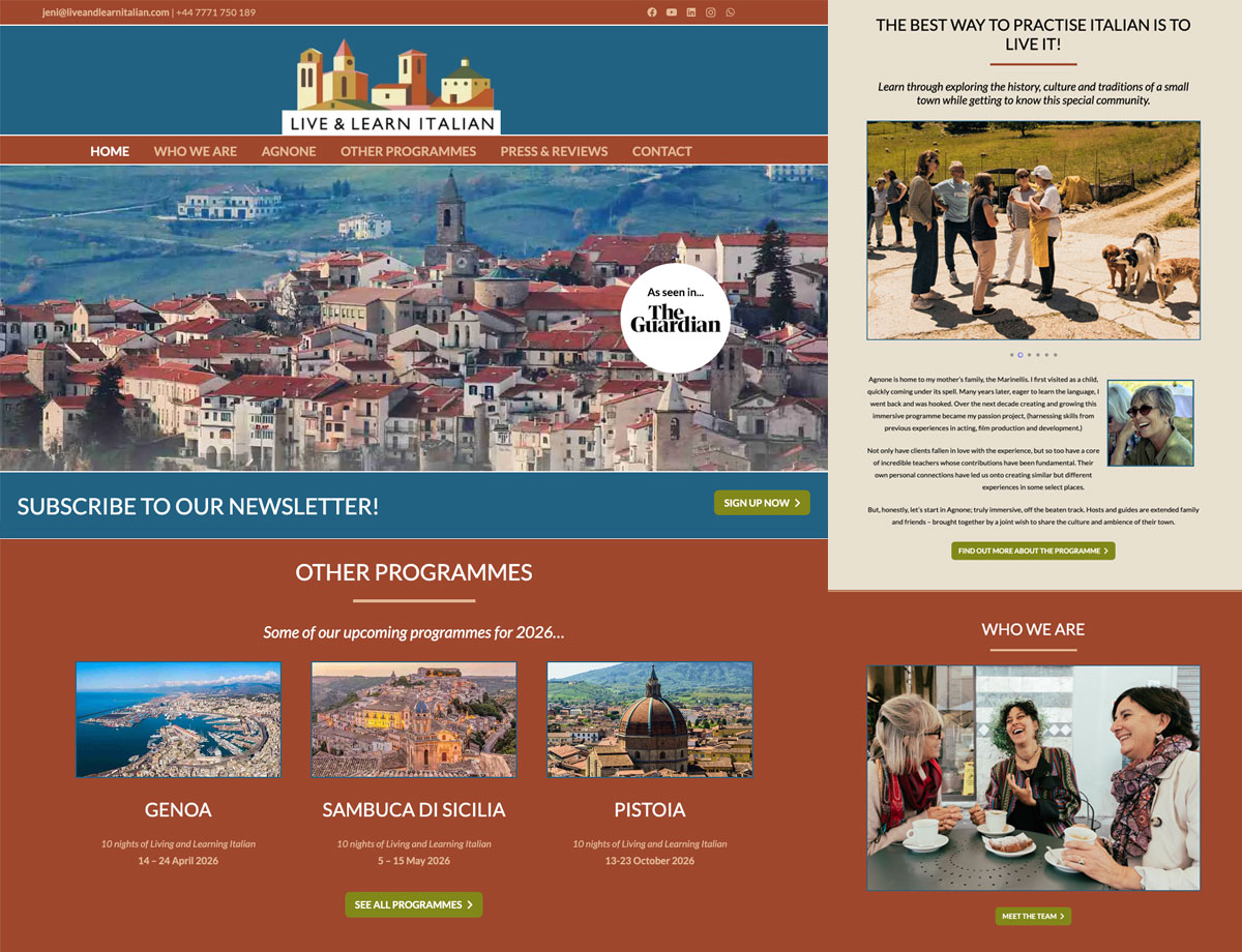
This, then. I had to redesign a website. That’s kind of it. It was a bit all over the place, with boxes of info everywhere, misaligned copy, mismatching font sizes and etcetera. Which is all easy enough to rectify, so the challenge here was to adhere to the demographic. We’re not covered in snakebite, moshing to Meshuggah in a disintegrating concrete dungeon here, pal. We’re mixing it with the silver surfers. I’m not sure if that’s a derogatory term these days, but hopefully not.
It’s people who have probably retired with lots of money who want to, well, learn Italian. Saga for posh people, I would say. Actually, that also sounds quite derisory, so I retract that. Either way, we’re going fairly conservative, not too much of a deviation from the style of the previous iteration and cutting out some of the needless bulk. Terracotta and the Azzurri blue for Franco Baresi and the lads.
Look, I just re-did a website, Ok. For the most part, it doesn’t matter what its content involves. And I’m sure my time will come with this sort of thing. But for now I’m happy with my snakebite. Meshuggah optional.