10 Days in Dance
Logo Development and Branding. Animation in the Rave Station.
If you’re someone with my rock and metal sensibilities, ten days in dance seems an awfully long time. I jest. I’m not 14 anymore, so I don’t really care about genres. If you say you prefer rock music to dance music and are offered Maroon 5 compared to New Order, for example, there’s only one correct choice. If you chose the former, please close this tab and go and lie in a ditch for a fortnight.
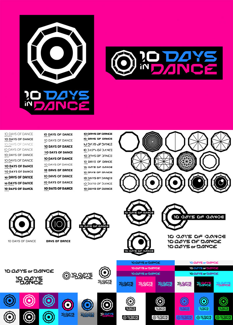
Anyway, this. I was briefed on a new podcast celebrating the dance music industry. I don’t know why it’s ten days, but it’s not my job to know. All I was given was that it had to include a shape that had ten sides (a decagon to the GCSE maths purists out there) and have an eye in the middle of it. So this is what I came up with. You can see the gradual process above. As with GCSE maths, it pays to show your working out.
In addition to what was asked, you might also note a couple of extra things that were deliberate. One, the ‘eye’ also looks like a plan view of a tent. Two, the whole thing is contained within a rough approximation of a ticket stub. You see. Multi-layered. Thanks for noticing.
The animation was a bit of an afterthought that I proposed, as dance music is nothing if not kinetic. That was all a bit about-face, as I was supplied the musical sting first and had to animate to that, rather than the other way round.
Now get your whistles and glow sticks and prepare for eight solid hours of ear drum destruction.
NB You might’ve noticed that 90% of the development work includes the erroneous phrase ’10 Days OF Dance’. That’s purely because I’m an idiot. Nice one.